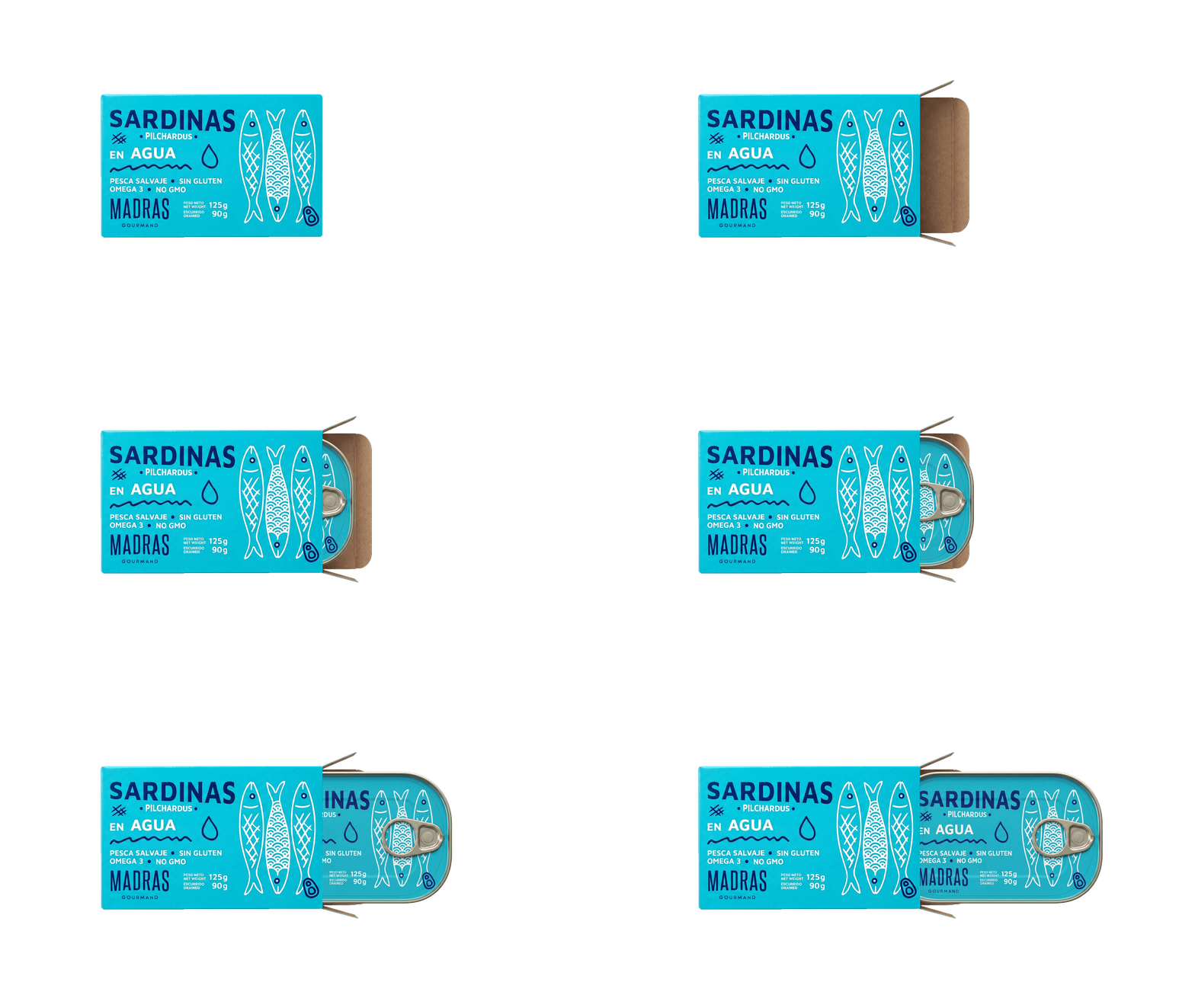
The project was approached as a rebranding, reviewing the logo, the typography and the graphic architecture to gain clarity, a contemporary feel and coherence. The brand was pared back to the essentials, becoming a structural element of the packaging rather than a decorative device.
The packaging design was built as a modular system, resting on a lead typeface and a freehand illustrated language that identifies the main product — the sardine — and everything served alongside it. Color tells each product apart and makes the range easier to navigate, while keeping it reading as one on the shelf.
The result is a more solid, more functional identity that reinforces the gourmet character of MADRAS and orders the range without losing warmth or personality, ready to grow and adapt to new products.
We work with brands that need to evolve without breaking what already works. If your brand is at that point, let’s talk.