EU – FP
A branding that us throw our the graduation caps in the air

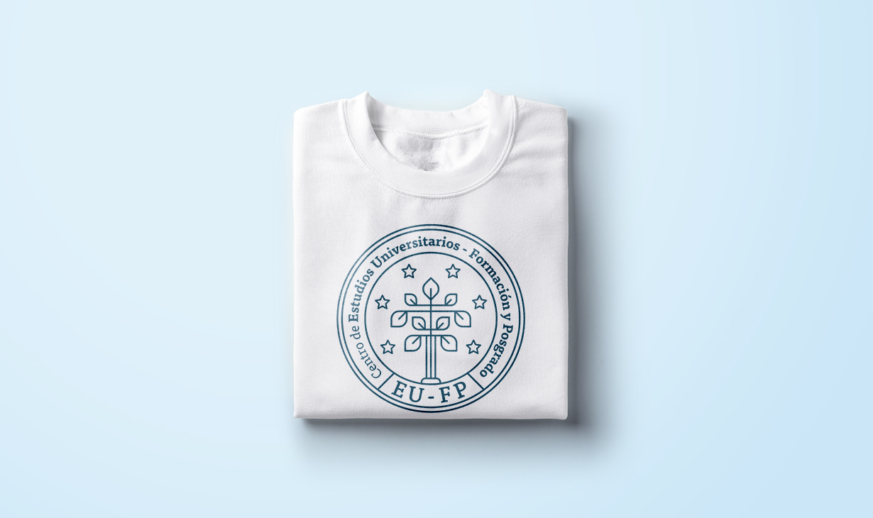
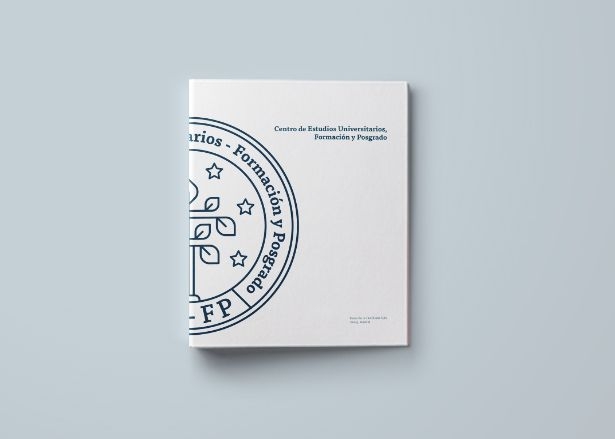
The result was an symbol of geometric lines with a structure that resembled a shield or medal and with a very strong conceptual base. First, we leaned on the concept of the tree of wisdom, closely associated with the field of education, to represent continuous regeneration and knowledge. We turned its trunk into a column, which denotes durability and stability, at the same time that it reminds us of ancient Greece and its schools. In addition, we used stars to symbolize clarity, light and a nod to the European character of EU-FP. The typography, slab serif, is classic, elegant and up-to-date, while still being friendly, dynamic and with good readability. As a corporate color we choose a dark blue that brings serenity, sobriety and importance to the brand.